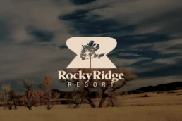
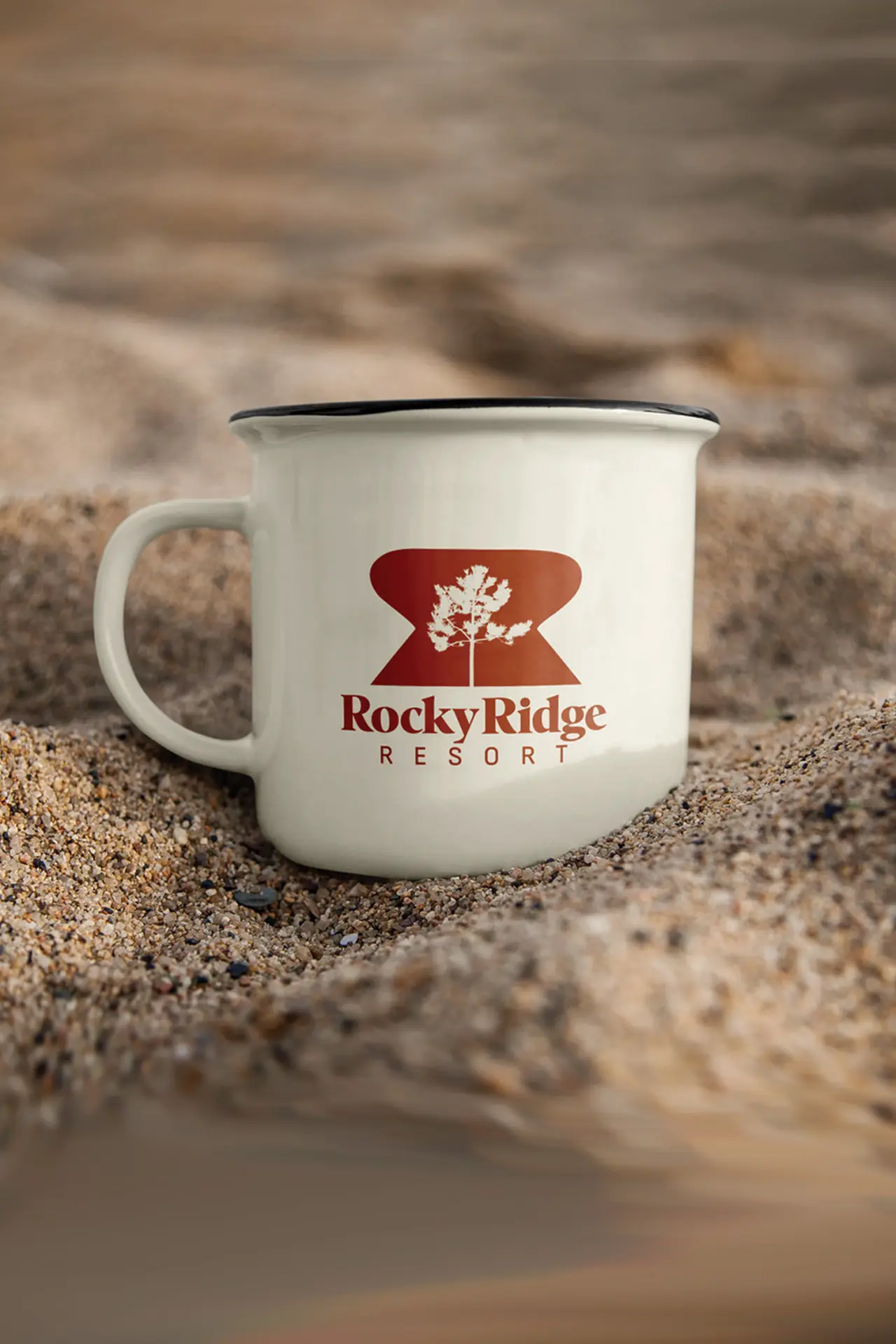
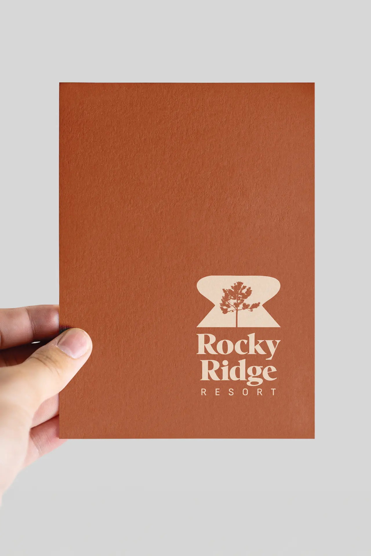
Brad came to us with a pencil sketch of his idea, and we took it up a notch. Combining an earthy tone with a strong burnt orange brought this logo to life. The curves of the symbol shape mimic an “R” and the tree silhouette centers the design. The two different font styles bring more interest to the final logo.
TypeBrand IdentityCategoryLogo DesignDesigned ByGraphic Ad