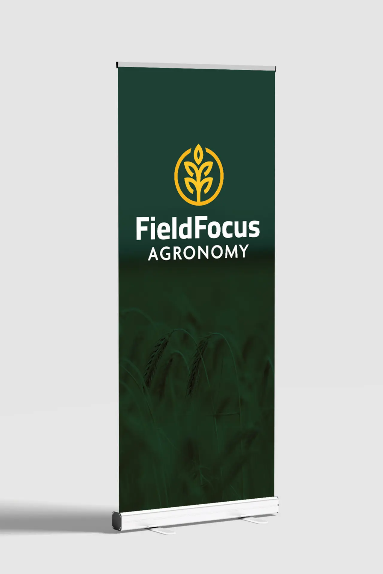
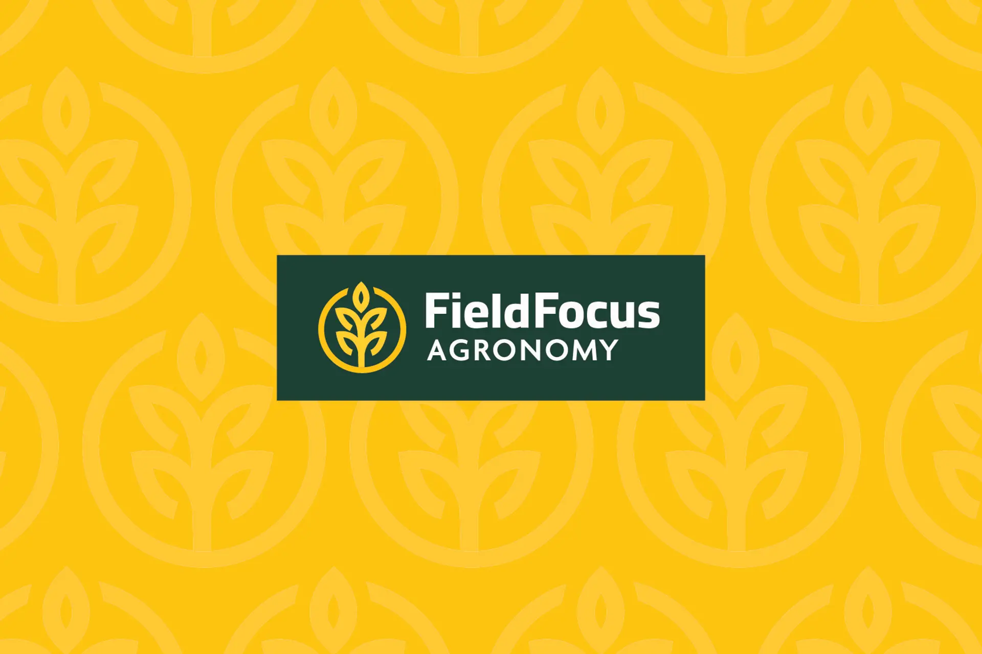
Brandon wanted a simple, yet strong logo that complimented his agronomy business. The wheat symbol mimics two “f”’s back to back to represent the “f”s in the FieldFocus name. The colour palette is strong and the font style is bold, yet simple. All elements of this logo were well thought out and come together nicely.
TypeBrand IdentityCategoryLogo DesignDesigned ByGraphic Ad